Tag Archive: brenton


cutekidsdesigns art by brenton wright

So over the last month, Ive been working on a small range of kids designs for my SpreadShirt shop “CuteKidsDesigns” http://cutekidsdesigns.spreadshirt.com.au/

This collection is designed for kids tees, but, you can Create and Customise your OWN garments or products with these designs too.

Click http://www.spreadshirt.com.au/design-your-own-t-shirt-C59 and when you “Choose a Design”, just search: brenton, in the Tshirt Designer, to see my available designs. Easy!

More Soon,

Beeno!


Image: “Hungry Monster”

hungry_monster_by_brentonwright

After a bit of an artistic hiatus, I whipped this lad out on a lazy Wednesday. Started as a doodle then evolved into Something Else – something Alien vs Pumpkinhead vs GodKnowsWhat? 🙂

Hope you like –

More Soon

Beeno!

Image: “Techno Zombie”

Brenton Wright Techno Zombie

My new image, the Techno Zombie!

Pencil drawing and shading at a4 size, scanned, and digital colour added.

To see how I made it, just CLICK on image for the “Step by Step Process Gif”.

More Soon,

Beeno!

Image: “Tomb Raider”

Tomb Raider Brenton Wright art

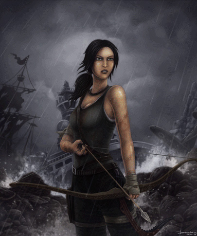
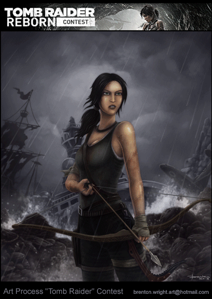
Here is my DeviantArt “Tomb Raider” contest entry. For a “step by step” process, CLICK on the Image above.

After I complete an image, I like to do a self critique, seeing how an image can be improved. Below is my Personal Postmortem.

What worked?

  • The image came together fast.
  • I had an idea of Lara Croft, sporting her bow and semi drawing an arrow as she exits the wreck strewn shore. She survived her first challenge, but what lies ahead?
  • One thumnbail design.
  • For something different, I used Poser for the rough character pose, then added further detail to the mockup in the paint program.
  • Printing this out as a guide, I then illustrated the image with pencil on my lap-board. Scanning the design, I then concentrated on tonal values and colour on the computer. 

What could use improvement?

  • Better Composition. It would have be better if character was less front-on. Look at more dynamic angles like a lower viewpoint. So more thumbnail variations could have revealed this early in the design.
  • Lighting. It’s not bad, but more intensity is needed in the Lighting, to help add interest and emphasis to the character. Another light source could have been hinted at.
  • More Colour Variation. The large amount of stormy grey subdues this design.
  • Larger Character. More emphasis on facial expressions. I ‘did’ deliberately design this image with extra detail left and right of character, so image could be cropped later as needed.
  • Character Facial Expression. Its no news to me that I need practice with character expressions. This is something I am working on, so expect to see more face studies in the future.

As always, it was a great learning experience.

More Soon,

Beeno!

Art Process: “Hydra”


Here is a “step by step” animation, showing the basic art process for my Hydra image.

This was one of several A5 sized drawing experiments done in pencil and charcoal, which I later scanned into photoshop and added digital colour to.

Postmortem:

Original art size too small.

  • I found the A5 size lacking in the amount of rendered detail I could achieve, so in my later pencil images, I have drawn them at A4 size – still easy to scan, more room for small details.

Unwanted paper texture during scanning.

  • Since this image, I have changed to a smoother paper. I use an illustration board designed primarily for Copic markers to enable me to retain a smooth blend with my paper stumps. My initial sketches on textured cartridge paper scanned with a high amount of visible paper texture, which despite being a “cool effect”, was not exactly what I was after in this case. This illustration board is fantastic, as it’s a sturdy card, it deals well with heavy amounts of rubbing (no pilling like cartridge paper), and kneaded erasers lift pencil and charcoal off easily during the highlighting pass.

Fixative.

  • I didn’t use any fixative, and using some might help me build up layers of charcoal blending, so the charcoal adheres to the smooth illustration board better. This could help me achieve a better tonal range in my illustration, prior to scanning and colouring.

More soon,

Beeno.